
itgeeks.my
SME e-commerce
Project Overview
Project Duration
Client
My Role
July-Aug 2025
itgeeks.my
UX Researcher and UI Designer
about itgeeks.my
itgeeks.my is an SME (Small-Medium Enterprise) company that buys and sells second-hand laptops and laptop services at affordable prices.
software type
E-Commerce web application
SME tech
industry
UX research
UI design
mobile design

target audience
The target demographic is university students and young adults looking for affordable, high-quality laptops that can last throughout their studies/works.


logo and branding
design thinking process
current problem
user feedback on current platform
Kano Model: competitor analysis
empathy map
defining problem user & business goals
setting project constraint.
UI screens
prototypes delivery
generate and evaluate solution ideas
Information Architecture
Hi-Fi wireframes.
usability testing
user feedback

emphatize
what's the current issues?
Unattractive design that doesn’t appeal to target audience.
Lack of personalization tailored to target audience .
Slow website load time causes users to abandon the site before engaging with content.
user stories
Gathered through interviews with three potential users: a university student, a fresh graduate, and a working adult.
"navigation is easy but could be smoother”
"the website is too slow, even for someone who’s patience as me feels so.”
"website layout is all over the place”
"there’s no clear brand identity. I don't know who they are. Like what can i get buying from them"


say
does
think
feel
empathy map

Must-Have (baseline expectations)
Delighter (unexpected but positive)
Definitely No (frustrates users)
Nice-to-Have (improves experience)
sen Q
All IT Hypermarket
KANO Model: competitor analysis
to identify competitors’ strengths and weaknesses

pain

gain
define

main pain points
Slow load times and laggy performance, forcing users to spend more time waiting than exploring.
performance issues
Unattractive, outdated design that fails to capture attention.
Confusing and inconsistent user flow, leaving users unsure where to go next.
design & usability
Lack of trust and sense of security, making users hesitant to complete transactions.
Weak brand identity, causing uncertainty about the company’s credibility.
trust & credibility

constraint to note
Limited financial resources due to SME scale.
Lack of technical resources (RAM limitations from COTS server hosting), so the design could not be too memory-intensive.
expected business outcomes
1
Increase purchases made through the website.
2
Reduce bounce rates and ensures users stay beyond 15 seconds.
expected user outcomes
1
Build trust through UI to increase confidence in making purchases.
2
Deliver an attractive, modern, and mobile-friendly design.
3
Provide a clear and structured flow that easy to understand
brainstorming process
ideate

Information Architecture (IA)
Hi-Fi Wireframe
Aa
DM Sans
design

DM Sans for its clean, modern look that feels professional. DM Sans strikes a perfect balance between rounded friendliness and sharp clarity
ABCDEFGHIJKLMNOPQRSTUVWXYZ
abcdefghijklmnopqrtsuvwxyz
1234567890
!@#$%^&*()?
typography

0056FF
conveys a sense of trust for users and aligns with the company’s primary branding, complementing orange.
FF5600
orange was used to complement the logo and maintain brand consistency.
neutral color
secondary color

colour


}
}
margin: 20px
gutter: 16px
column: 4px
rows: 10px
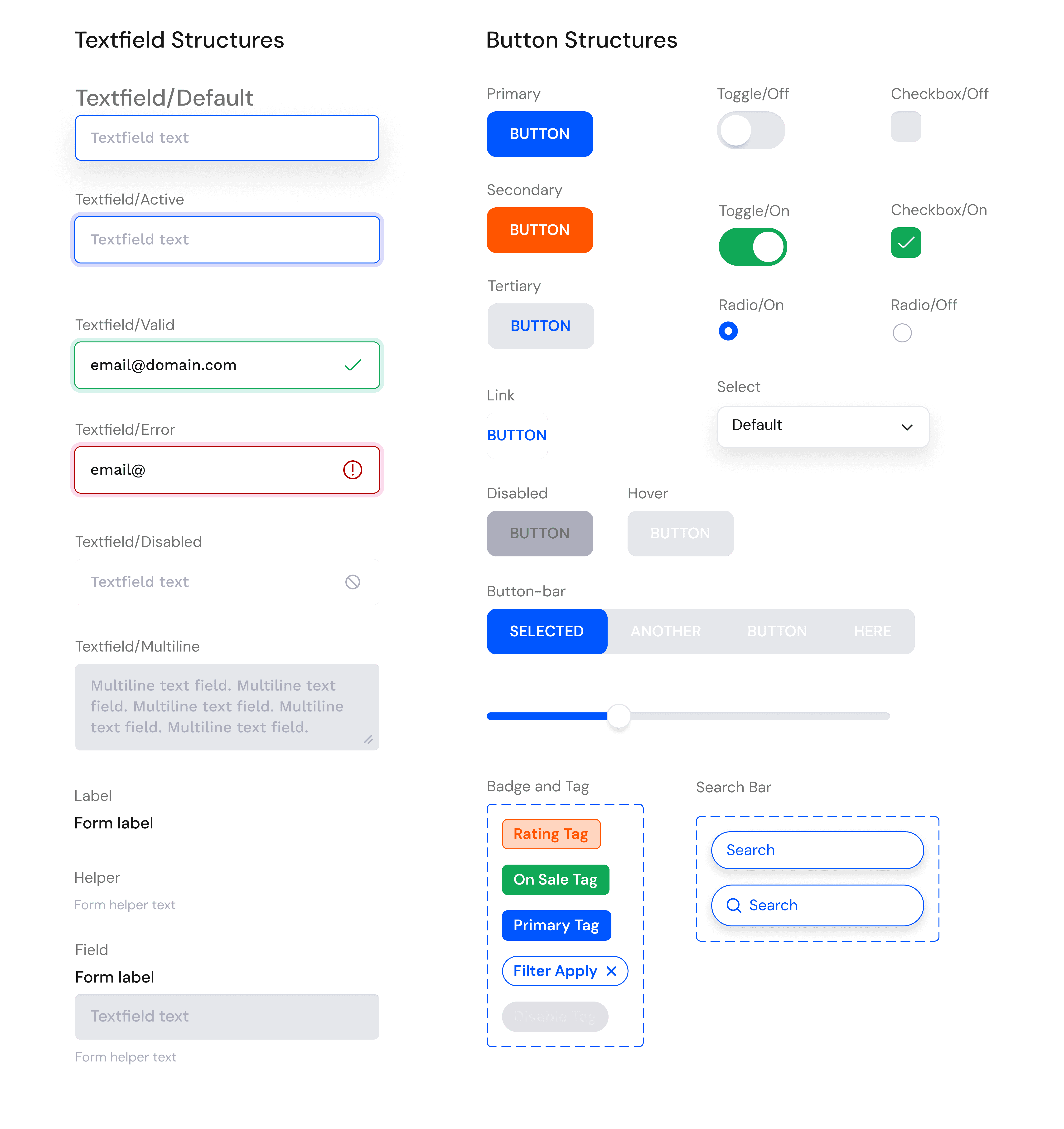
UI kits
radius, elevation, grid system
and UI components

UI screens

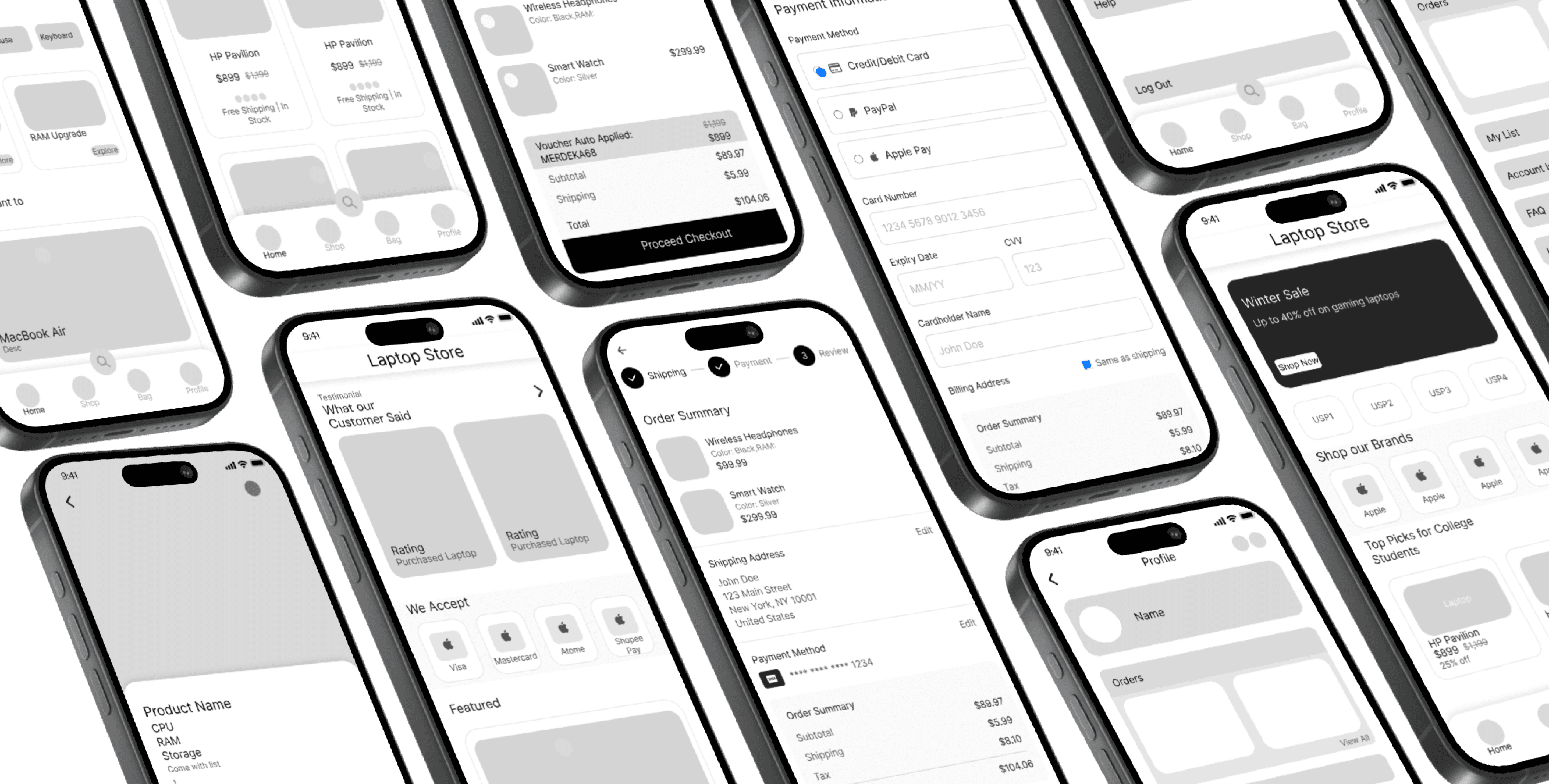
Home Page
|
|
|
|
|
|
|
|
|
|
|
|
|
|
|
|
|
|
|
|
|
|
|
|
|
|
|
|
|
|
|
|
Testimonial section on the homepage showcases real customer reviews, helping build trust and credibility
Start the web with auto-scrolling promotional banner showcases offers in descending order of value, ensuring the most impactful promotions are seen first
Prominent USP section communicates the distinct value customers gain when purchasing from them, reinforcing differentiation and trust.
Showcases the well-known brands they carry, reassuring customers through brand familiarity
Leverages social proof and relatability to influence user who are more likely to be swayed by peer-driven recommendations when making purchase decisions.
Accepted payment options are prominently displayed, featuring well-known and commonly used methods among Malaysian buyers helps reducing friction.

|
|
|
|
|
Product interface is kept simple with minimal colors and larger images to draw attention directly to the items reducing distractions. prominent use of orange highlights product ratings drawing user attention
Search recommendation to assists users who feel uncertain about where to begin and to reduce stagnation in user flow
|
|
|
|
|

|
|
|
|
|
Includes the logos of accepted payment methods, leveraging visual recognition as user often trust familiar symbols more than text labels.

|
|
|
|
|
|
|
|
|
|
Follows a Shopee-inspired layout to create familiarity, improving user understanding and reducing the learning curve.

A three-step checkout uses progressive disclosure to reduce cognitive load, creating a focused flow that minimizes drop-offs and improves conversion rates.
|
|
|
|
|
Cart includes an estimated shipping fee to provide transparency, ensuring users are aware of costs upfront. Builds trust and helps reduce cart abandonment by preventing hidden charges at checkout

prototype
link to full prototype
🔹 Design & Visual Experience
What are your first impressions?
User commented that some text at homepage are unreadable
Text hierarchy and readability could be improved.
Can you see a visible brand identity on the homepage?
Brand identity was not strongly communicated; users mainly recognized it through the color scheme.
Rate the tone of the site (1 = boring, 3 = neutral, 5 = engaging).
Average score: 3 (neutral).
Rate the likeliness of staying and continuing to browse (1 = highly unlikely, 5 = highly likely).
Average score: 4 (likely to stay).
Users noted that the homepage played the biggest role in influencing whether they stayed longer.
How could the design be made more engaging?
Suggested improvements included:
Adding autoscroll functionality to promotional banners.
Removing search recommendations, as users preferred to directly use the search bar.
🔹 Navigation & Product Flow
If you are unsure where to begin, where would you click to proceed?
Users indicated they would click on “Top Picks for College,” assuming these were the most popular. They note "in my mind if this product has more sell than it most likely a top pick"
Where would you search for a laptop within budget?
Users expected filtering options to be available on the product page rather than only on the product listing page, hence some stagnation occur trying to find filter in product page.
User were task to find a product, add to cart, and proceed to checkout
Rate likeliness of you facing stagnation during the process (1 = less likely, 5 = more likely).
Score: 2 → The flow was consistent and met expectations.
Users noted that they appreciate being able to review product details before adding items to the cart.
Checkout details were clear
However the the shipping information page felt crowded and user note that they felt "tiring" just to fill details from the look of the page itself.
How easy was it to complete the task (1 = hard, 5 = easy)?
Score: 3.5 → Overall manageable, though with some friction.
Some users who browsed products from the homepage expected recommended items to display product details directly, rather than redirecting them to a separate product page.
Suggested improvement: display product details directly within homepage recommendations reducing steps.
How you normally do the task?
For less experienced users, the typical process was: browse items on the homepage and product page → review product details → proceed to checkout.
For more experienced users, the process was more direct: browse or search → review briefly → proceed to checkout, with minimal reliance on the product page.
user point at "Top Picks for College"
Would the website overall motivate you to make a purchase?
Would you return to this website to make another purchase?
Users preferred version A due to visual cues (icons for payment options) that conveyed professionalism and familiarity.
Version B, with text-only payment options, was perceived as less professional.
Mostly yes, because the checkout flow was described as easy and uncomplicated.
Users noted that if they already know what they want to buy, the site would motivate them to complete the purchase.
Users said they would return unless a significantly better site was found, due to the clear layout.
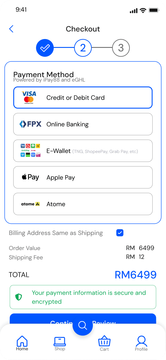

Which version provides a stronger sense of trust?
🔹 Perceived Trust & Credibility
A usability test was conducted to evaluate task flow, navigation clarity, and checkout ease. Additional questions were included to capture user perceptions of trust, attractiveness, and engagement, as these factors are directly relevant to the research goals. The test participants were the same users interviewed during the empathize phase.
Testing and Outcome
Impact and Reflection
Observations
Users often preferred using the back button instead of the site’s navigation controls.
Users tended to click immediately on products displayed on the homepage, showing reliance on initial visibility.
The action of “Buy” was generally perceived as adding to cart, rather than an instant purchase.
Several users experienced stagnation on the product page, as they did not understand the purpose of brand logos or realize they were clickable.
Improvements
Prioritize text readability over purely visually appealing elements to support quick comprehension.
Use microcopy to guide user flow. For example, adding labels or titles above brand logos can clarify that they are clickable.
Consider user flow for experience and confident user that are sure of what they are looking for in the website
Minimize unnecessary clicks to access product details. Adopting a “three-click rule” can help reduce stagnation and potential drop-offs before users reach their goals.
Heat map testing using hi-fi wireframe to gain more insight before straitgh to prototype